

There are a lot of great airline logos out there, but however stylish one may look when fully integrated into an airline’s color scheme, is another story. The question is, how does it look as a stand-alone symbol?
Most airline logos today are nothing more than a shapeless flourish or obscure stroke. Many airlines don’t even have a logo, relying instead on the name alone, in the hopes that some strange new font might elevate its appearance.
When it comes to the world’s best airline logos, the classics rule. They have endured by remaining true to their original concept.
The Makings of a Great Logo
The principles of flag design could be used to determine a great logo – a simple design, no words or letters, and above all, meaningful symbolism. In other words, it should be an accurate reflection of the place it represents.
Then there’s my own personal test. The logo just has to plain look good when gracing a beverage napkin, cabin wall or First Class wine glass. It’s hardly a scientific analysis, but what can I say, I’m a sucker for good looks. The logo should add a touch of gravitas. If it’s a meaningful symbol, and looks great on its own, then it gets an A+ from me.
Few airline logos ever reach icon status, but the ones listed below, surely have. They have stood the test of time and are instantly recognizable.
Most of all, they say something about their respective airline – and yes, every one of them looks fantastic on a beverage napkin or wine glass.
In alphabetical order, I give you, the world’s greatest airline logos.
AeroMexico

AeroMexico’s Eagle Knight logo does several things, perfectly. It reflects the country’s ancient culture, it changes with the times, yet remains true to its original concept. The great Eagle Knight, while modernized, is much the same as when it was introduced in 1960. Between 1934 and 1960, AeroMexico used only a stylized eagle for its logo.
Air Canada

There’s no denying, the maple leaf is about as Canadian as it gets, and anyone who sees this simple, yet highly effective logo, is rarely confused as to its origins. Air Canada introduced its rondelle maple leaf logo in 1964, and it lasted until 1992. That year, the airline ditched the circular component of the logo, replacing it with just the maple leaf. Looking to embrace the airline’s legacy for its 80th birthday in 2017, the rondelle (a French term for a hockey puck), returned. A wise choice!
Delta

With the exception of a 14-year gap in the 1940s and 1950s, the Delta triangle logo has been with us in some shape or form, since 1929. The triangle stood for the letter “D” or “Delta,” in the Greek alphabet. The Delta name even reflects the airline’s geographic beginnings, in the Mississippi Delta region. Today’s striking logo harkens back to 1959, when after an absence of a decade or more, the triangle was re-introduced in the familiar “widget” style that we know today.
Iran Air

Not a well-known logo outside the Middle East or Europe, it nevertheless has established a longevity rarely seen by airline logo standards. In use since 1961, the logo was designed by a 22-year old Iranian man who entered it into the national competition that had been tasked with finding a logo for the newly nationalized carrier. Based on the mythological Persian griffin named Homa, the logo features an eagle’s head, cow’s ears, and a horse’s mane. Legend says that without legs, the griffin lives its entire life flying high above the earth. Nearly 60 years old, the logo remains virtually unchanged.

Japan Air Lines
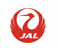
This logo is pure class. Known as tsurumaru, or the crane circle, the stylized Japanese red-crown crane (which is viewed in Japan as a symbol of long life and prosperity) is depicted with its wings extended, as if in flight. The airline wanted an all new logo for its first jet aircraft, the Douglas DC-8, and in 1959, the new logo took flight. The graceful crane logo was in use for more than 40 years, when in 2002, it was unceremoniously replaced by a red, rising sun logo. It took JAL eight years to recognize its branding blunder, but in 2011, they saw the light and brought back the classic crane circle logo – this time, hopefully, for good.
Lufthansa

Like Japan Air Lines, Lufthansa too uses a stylized crane as its logo. Lufthansa’s logo however was created in 1918, more than 40 years earlier that JAL’s. In fact, Lufthansa’s crane is the world’s oldest airline logo still in use. And while traditionalists are giving the 2018 restyle a thumbs-down, due mostly to the dropping of its “Lufthansa yellow” background, it can still be said that the 100-year old crane is still very much a Lufthansa bird.
Qantas
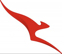
Next to Air Canada’s maple leaf, the “flying kangaroo” of Qantas is perhaps the most recognizable airline logo in the world, at least in terms of its home and birthplace. Kangaroos after all, are indigenous to Australia alone, so what better way to signify the airline’s home than with the lovable marsupial. The first kangaroo logo to grace a Qantas aircraft was in 1944. And while the logo has been restyled and updated a half-dozen times since then, it remains as iconic, and as recognizable as ever. Today’s iteration is sleek and stylish, and looks great on anything it touches.
– Honorable Mentions –
Air New Zealand

Air New Zealand’s iconic Koru logo, depicts the unfolding frond of a Ponga Fern, something found throughout the island nation. A symbol used by the indigenous Maori culture, the koru signifies new life, growth, strength and peace. Early Polynesians also used the symbol on their canoes which sailed between the many Pacific islands. The koru first appeared on an Air New Zealand aircraft in 1973. The current logo style dates back to 2006.
Alaska

Ok, I admit, as handsome and reassuring as “Chester” the Inuit Eskimo is, it would seem a bit odd to see him staring back at you from a cabin wall. But this lovable logo, which dates back to the airline’s 1972 rebrand, captures the essence of the airline, and its namesake state. Since its introduction 47 years ago, the face has softened, a smile has appeared, and the colors have become softer, yet brighter. If Alaska chooses to stick with its name, then this logo says it all!
– No Longer with Us –
Pan Am

With a fleet of new Boeing 707s and Douglas DC-8s on order, Pan Am set about designing a logo for the new jet-age aircraft. Unveiled with the delivery of the first Boeing 707 in August of 1958, Pan Am’s famous blue globe would become what is arguably, the most iconic airline logo of all time. It would grace the tail of Pan Am planes until the very end, when the airline shut down in December 1991.
North Central Airlines / Republic Airlines

It may not have been recognized globally, but in the United States at least, the mallard duck of North Central Airlines was well-known. Designed in 1947 by Milwaukee industrial designer, Karl Brocken, the mallard duck encircled by a ring that symbolized the sun and the moon, perfectly encapsulated North Central’s culture, birthplace and route network. Embraced by employees and passengers alike, the duck logo would be referred to affectionately as “Herman.”
After its purchase of Southern Airways in 1979, North Central would change its name to Republic Airlines. A year later, Republic would purchase Hughes Airwest. With that, Republic would fly to more cities than any other U.S. airline – nearly 200 cities in fact, throughout the U.S., Canada, Mexico and the Caribbean. Herman the duck would reach great heights during its 40-year life with North Central and Republic. The logo would disappear in 1986 when Republic was merged into Northwest Airlines.
Todd Sturm is a freelance travel writer based in Nashville, TN and Brisbane, Australia.


